Data Stories
Embedded in the video are a number of charts and graphics generated from NYC Open Data. Although abstracted in the artwork, each has its own story that ties back to project themes of children’s NYC experience, the impact of the pandemic, unseen environmental factors, and potentials for resilient joy.
Blood Lead Levels in Children Under 6
NYC Open City Data – Meta Analysis
Blood Lead Levels in Children Under 6
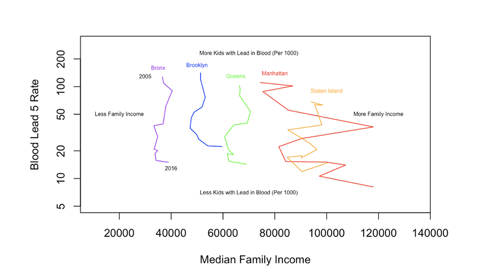
This visualization shows a short, narrow history of the paired economic and physical health of the five NYC boroughs, by combining two distinct data sets. Each borough traces out a downward curve in the space of blood lead levels in children (good news for all!) and a more stable path for median family income. As is often the case with progress, everyone may be getting better health wise, but the rich get more better… and richer. Starting from the more “Flint, Michigan” upper left region of the spectrum, the Bronx, Brooklyn, and Queens have improved in blood lead levels, at the same time as suffering more from the recession and salary stagnation. In contrast, Manhattan has moved to the richer right while, at the same time, landing on significantly lower blood lead levels. On a year-to-year basis this pattern is not as clear given the noisy fluctuations, but over this decade-plus “plinko” journey, the inequality gradually adds up.
-John Stockton
NYC Open City Data – Meta Analysis

Children tend to be missing or only indirectly indicated in public data. In this project we knew that we would be unable to directly “touch” New York’s children in the data. We knew that we would be, at best, playing a game where we were able to touch their shadows for a fleeting moment.
One of the ways I looked for children in the data was to do a meta-analysis of children in the NYC OpenCity data. I searched the data portal for the term “children.” The search produced 83 results. I scraped the descriptions for each of the 83 results and then added two additional columns to indicate whether the data was actually about children themselves and whether it related to trauma, joy, or neither.
Of the 83, I coded 19 of the 83 as directly “touching” children. Of those 19, 17 were related to trauma and none to joy.
-Rachel Blake
Crime in 2020

The story of crime during the year of Covid is like the story of most any other subject throughout the pandemic: there was a before, a during, then a return to… a new normal. When you look at the time series of crime over the bulk of the year, and normalize each crime to its starting position (i.e., line them up vertically on the left), you can bring data-driven color to what the new normal is. Overall NYC crime dropped then came back (grey). Some crimes predictably dropped to near zero, like in-store theft, including shoplifting (green). Some, though lower in absolute numbers compared to the others, rose above their previous levels, such as murder (blue) and the theft of perpetually parked cars (orange). Others, like child endangerment (red), dropped, then rose, then dropped, possibly reflecting the changing pressures on family life during lockdown. This data begs the question that always haunts crime statistics: how do we tell the difference between the crimes that are occurring versus those that are being reported? Both effects are certainly evolving over this time, but may be impossible to fully disentangle from imperfect data. Policies can only control what can be observed, and the pandemic has not only changed patterns in crimes but probably patterns in observation rates as well.
– John Stockton
No Adults
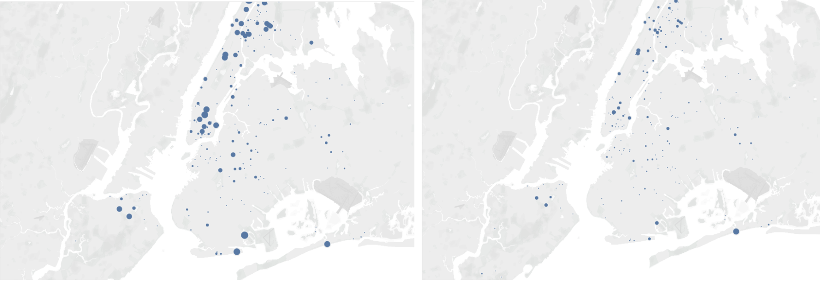
We mapped visitor data from 2017 through 2020 for playgrounds that had a “no adults” policy for some portion of the playground. There was a significant drop off in visitors in 2020 (see 2019 vs 2020, above). However, the data here is not a perfect fit for our question. The visitor information is actually tied to parks. In some cases there are multiple playgrounds within one park, but in other cases the park may be the playground.
– Rachel Blake
Playground Equipment
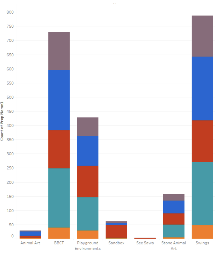
We were able to identify several types of traditional playground equipment and where that equipment is located. However, there are major limitations from the perspective of what a child might want to know and what might contribute to children’s joy.
The data regarding equipment seems to be entirely a binary yes/no. So, the data does not tell us, for example, how many swings — each location contains. A question of utmost importance to many children. We can see that swings and basketball courts are quite common amenities, while sandboxes are quite rare with almost all in Manhattan. Only 1 seesaw is listed in the data!
– Rachel Blake

From this data, I created a series of color-coded props depicting park play structures by borough – a basketball counts out the courts in small dots, a skateboard delineates skateparks throughout the city. In the Parks Complaint data, we saw mention of people bringing their own swings to parks during COVID-19 closures. Inspired by these renegade swings, I created a version that breaks down swing-set data by borough. As Rachel Blake explains, this data – although accessible – does not point to the quantity or quality of play structures within parks, rather its binary existence.
– Cindy Stockton Moore
Outperforming Dog Bite Data
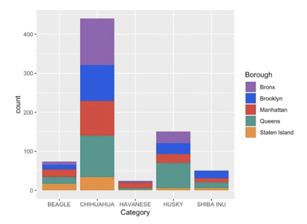
Each NYC borough has a standout dog breed who punches/bites above their weight. While the species who bite the absolute most are not all shown here, we show the count breakdown for each of the species who outperform their expectation numbers for attacks in one borough compared to the others:
Beagle bites are over-indexed in Staten Island,
Chihuahuas for the Bronx,
Havanese for Manhattan,
Huskies for Queens
and
Shiba Inus for Brooklyn.
This data gives an indication of the personality of each borough as well as what unique dangers might lurk for unsuspecting puppy petters. Maybe this data could be used to customize warning signs for particular neighborhoods?
When merged with an independent set of dog naming data (licenses), this data takes on even more personality. Chihuahuas are a menace no matter what the borough, and this data tells you that this puppy perpetrator is more likely to be called Chiquita or Pedro, a name likely inspired by a character from the movie “The Lady and the Tramp”. This observation relates to a recurring theme in the data: many of the top indexing names for a given species seem to be inspired by animals from movies and pop culture more generally. Also see Brinkley the Golden Retriever from “You’ve Got Mail”, or Gizmo from “Gremlins” (apparently Shih-Tzu’s are closely related to Mogwais).
-John Stockton
I used John’s outperforming dog data to create a series of stackable bar graphs out of wood, where each 1/4″ equals one bite per breed. This data was then disassembled and rebuilt into new data structures.
-Cindy Stockton Moore
Complaining About Children
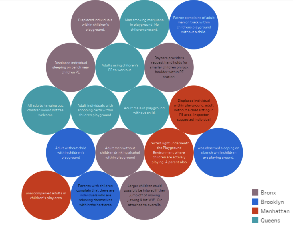
We also searched in the complaints (narrative comments of the PIPS-plus inspection program) for mentions of children. However, there were very few. Many of them were actually complaining about adults in the playground without children.
– Rachel Blake
Open Streets – March 2021
Drawing a large-scale chart directly on the ground, we encouraged the public to physically interact with the NYCOpenData. Performing data visualizations in a public space, we invite free play where people can interact and activate the data in un-prescribed ways. Set up outside of Tompkins Square Park on Avenue B, we brought a variety of props from ‘Shadow Tag’ for street play. We also created a new large ball graph that visualized attendance counts over the course of the pandemic year in the playgrounds closest to our location. Despite the cold March day and the on-going pandemic precautions, we enjoyed watching kids activate the data in surprising ways!
-Cindy Stockton Moore
Children Visualizing NYC Park Complaints
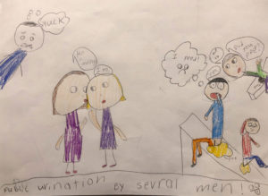
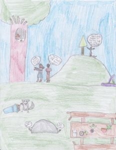
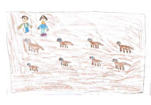
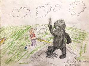
Through our discussions, we also recognize that the data itself – outside the gloom and doom – also has potential for joy. We culled the NYC Park Complaint database for entries that were outliers; either worded in amusing ways, farcically lacking in empathy, or in some other way “funny.” We then offered these captions to children to illustrate. This gallery – although not featured in the video – showcases their data visualizations. For me, allowing children to present the data is akin to inviting them to use the props in the video; it’s a process of responsive collaboration. Working with children, new possibilities of ‘playing with data’ emerge – introducing their viewpoints that were lacking in the original datasources.
– Cindy Stockton Moore
Links to NYC Open Data
Explore some of the datasets.
NYC Open Datasets used include: Directory of playgrounds, Schoolyard to playground, Park Closure Status due to COVID-19, Kids in Motion Playground Programming, Children’s Play Areas, CPAs, Walk-to-a-Park Service Area, NYC Complaint Map, Park Inspection Program, Park Inspection Program – Inventory, Daily Tasks Park Cleaning Records, Children Under 6 yrs with Elevated Blood Lead Levels (BLL), DOHMH Dog Bite Data, Parks Closure Status Due to COVID-19: Skate Parks
![OpenStreets freeplay, March 6, 2021. [Photo by Zahra Mirmalek]](https://shadowtagproject.com/wp-content/uploads/2021/08/KidsFreePlay-300x200.jpg)
![Park Amenities by Borough, Spray Chalk March 6, 2021. [Photo by Zahra Mirmalek]](https://shadowtagproject.com/wp-content/uploads/2021/08/SprayChalkGraph-300x200.jpg)
![Video Props on display, March 6, 2021. [Photo by Zahra Mirmalek]](https://shadowtagproject.com/wp-content/uploads/2021/08/VideoPropsDisplay-300x200.jpg)

![Park amenities by Borough, March 6, 2021. [Photo by Zahra Mirmalek]](https://shadowtagproject.com/wp-content/uploads/2021/08/GraphWalker-203x300.jpg)
![Live Data Graphing with Hoang Pham, March 6, 2021. [Photo by Zahra Mirmalek]](https://shadowtagproject.com/wp-content/uploads/2021/08/RealtimeGraphing-200x300.jpg)
![Stackable Bar Charts, Dog Bites by Borough, Outperformers March 6, 2021. [Photo by Zahra Mirmalek]](https://shadowtagproject.com/wp-content/uploads/2021/08/StackableGraphs-200x300.jpg)

